
Tableau Data Visualization in 5 Steps

In today’s data-driven world, data visualization allows us to organize data in a compelling and easy-to-understand way. Our brains value visuals over any other type of information, and according to research conducted by MIT neuroscientists, 90 percent of the data transmitted to the brain is visual.
Tableau is a powerful data visualization platform and market leader in data visualization and business intelligence. Since its launch in February 2010, the Tableau Community has more than one million members, spanning over 500 user groups worldwide. Tableau is compatible with multiple data sources, including Excel, SQL Server, and cloud-based data repositories, making it an excellent choice for Data Scientists.
While learning Tableau, I was intrigued to use my knowledge to understand the world’s COVID-19 pandemic situation. Therefore, I built an interactive dashboard to visualize the COVID-19 data and understand the condition. I have described the process in five steps.
Step 1: Data Collection
Tableau has COVID-19 data set available on their website. To download the data set, browse to the following link. Navigate to “Access the data” and click on download CSV (Comma Separated Value) file, or you can download COVID-19 case data directly through Web Data Connector. It is a data platform where users can post, search, and collaborate on data sets in a meaningful way.
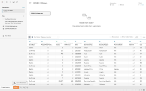
Step 2: Importing Data into Tableau
Importing data is pretty simple. You need to select the data file or data source and drag it on the left panel of Tableau. I used the “Cases” file for this exercise to build my dashboard. The Cases file has a collection of COVID-19 data from around the world. You can filter it based on the data you would like to use. For my dashboard, I used to date and confirmed Cases for all the countries worldwide to visualize Data on my dashboard.
Step 3: Filter Data for visualization
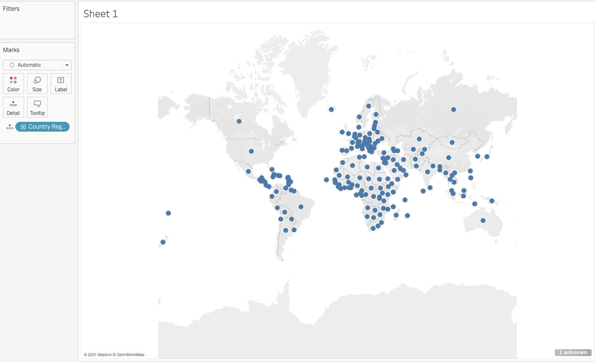
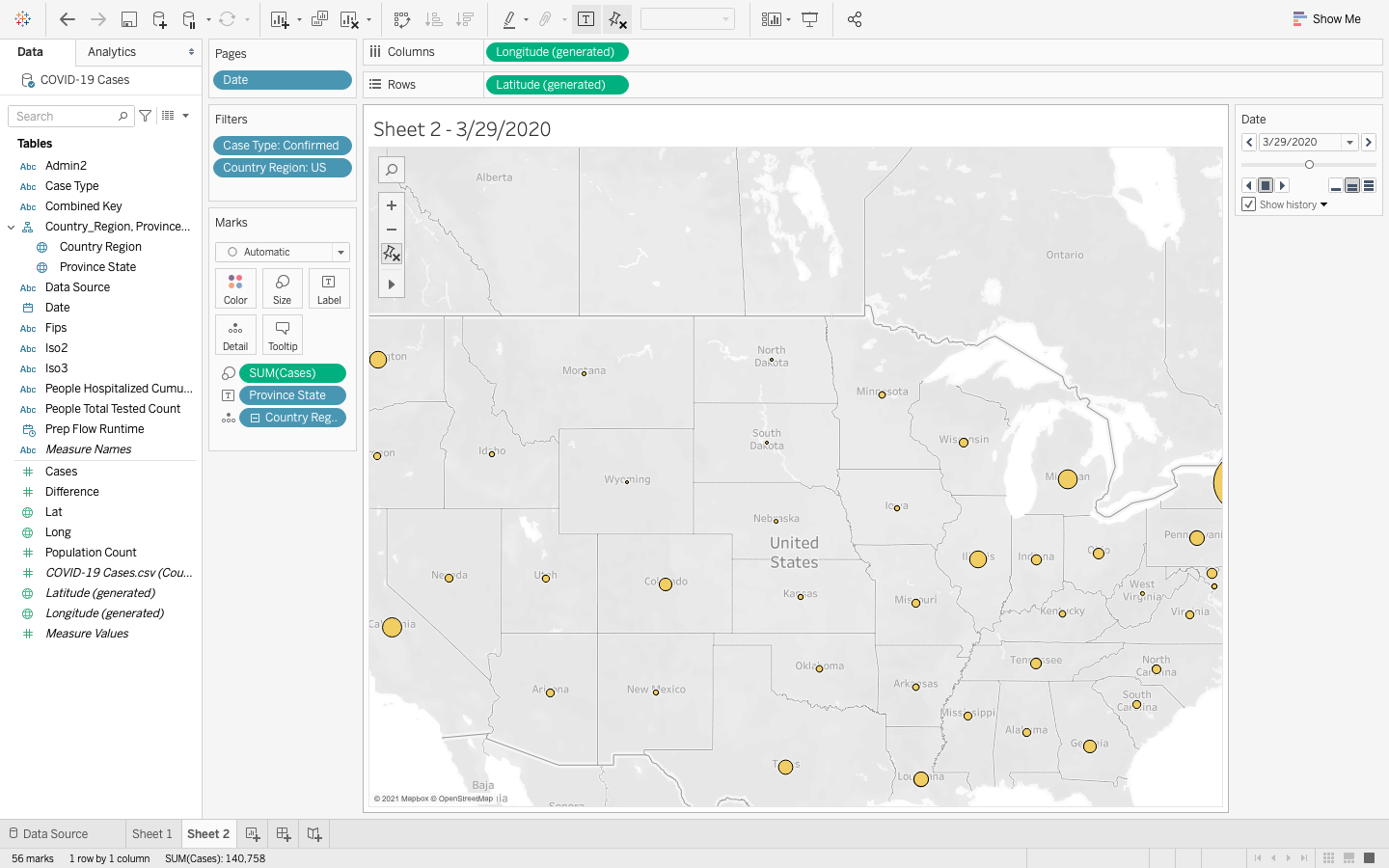
- The next step is to filter the data so it can easily be understood. I filtered by USA, California. We would also need Latitude and Longitude information to plot data on the map. Select Latitude and Longitude and drop them at columns and rows. The data will show on the map by simply clicking the map option.
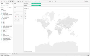
- Now the dashboard has l0cation information, it’s time to visualize country data. Please select the country region data; it will plot blue dots on the world map. If you need any specific country data, select the country you would like to show data on the map.
Step 4: Building Dashboard
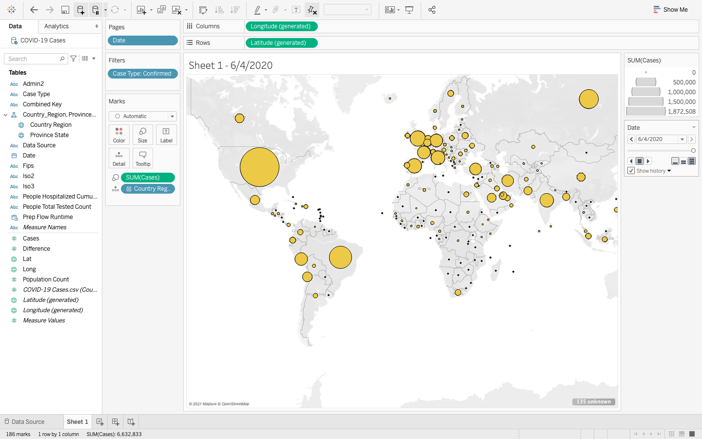
- The final step is to plot COVID-19 Cases on the map. To do that, select Case Type Confirmed and Date from the left panel and drop it on the filter. Once done, the dashboard will refresh and show the actual cases in the countries. Now try different dates to see if the rate of COVID-19 cases increased or decreased in 2020.
- Building this dashboard is easy, and you don’t need extra steps to visualize it. I created a basic interactive dashboard that conveys these summarized statistics at a glance and understands the world’s situation regarding COVID-19.
COVID-19 Data
Step 5: Data Insights
- As per my observation, there was a drastic increase in COVID-19 confirmed cases worldwide.
- As our society is in vaccination, the situation may be getting relieving in many places. If anyone wants to take this prototype and try to improve this dashboard by comparing COVID -19 data by country as time elapses – we welcome such opportunities for collaboration.
Resources & References
The fastest way to learn Tableau is by practicing it. Below, I have referenced resources that have helped me:


