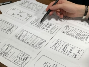
A wireframe is a prerequisite of every UI design. It is a structural blueprint of an application with limited visual characteristics. It helps confirm the essential elements, their logical positioning on the application, and how they will integrate to offer a user-friendly experience.
It allows designers to communicate their ideas with the client and quickly adapt to changes if necessary. On the other hand, it lets the client know what to expect. Thus, reducing revision time and rebuilding process in the later stages of the software development.
To get the most out of your design, it is preferred to keep the following best practices in mind while creating one.
Basic Understanding of the Application
Have an initial idea of what the application is required to do, the logical hierarchy in the application, the content organization, and possible user flows. Your understanding will improve as you work through your designs.
Use Paper and Pencil
Before jumping to software for creating wireframes, start with sketching on paper. Apply different designs and compare them with each other. This way, you will know what method works best for the application in focus.
Focus on Main Application Components
Choose layouts that sit well with the main components of the application. The ones with better user flows can help reach the required action items quickly. It will give you a clear direction for future iterations of the design.
Consider Screen Sizes
Start with the smallest possible screen size. This will help prioritize the content and design throughout the application.

Keep the Design Simple
Start with only the essential elements that are required to perform the functions. Once the client approves the basic design concept, you can always enhance it by adding more details. Also, begin your design with low fidelity, including basic shapes like squares, rectangles, circles, or lines. Use only one or two fonts – differentiate the information hierarchy by changing the font size or styling instead of adding more fonts.
Avoid Distraction
It is recommended to use black & white or grayscale for creating wireframes. The primary purpose is to keep the client focused on the design rather than the styling and visual appearance of the application. Although there is no hard and fast rule, you can always add colors to bring attention to the action items, but use them carefully.
Meet User’s Expectations
The best way to do it is to follow industry standards. Apply design conventions used across the applications. For example, the user will always expect the menu to be on top where it is accessible. If the user cannot navigate a common action item quickly, the chances are that the user will be reluctant to use your application.

Creating Predictability
Add design elements that will let the user know what to expect next. It will enhance the overall user experience and make them feel more comfortable navigating the application. For example, creating an outline of steps the user will go through while checking out or displaying the loading sign while waiting for the next step in the process.
Speeding the Process
Time is of the essence for both designers and clients. It is always a good idea to properly label each component of your design and add a description. Well annotated methods significantly reduce the miscommunication between the design team and the client, making them more likely to get approved.
Maintain Consistency
Keeping the design layout consistent throughout the application is essential. It familiarizes the user with the main application components, speeds up their navigation, and adds user-friendliness to the application.
Applying these practices to wireframing for designing UI will encourage as much feedback as possible to catch design problems early on, set realistic design expectations, and test what will work best for application users. Thus, making the application structurally sound and reliable.


Leave A Comment